Sunday, November 30, 2008

Global Warming

. Sunday, November 30, 2008
0 comments


The designer group NEL tells stories through objects. They design taking ideas from actual facts. Politics, social issues. The "Global Warming" project is a rug where a polar bear finds himself lost on a iceberg, metaphor of a involuntary castaway in the middle of the ocean, victim of global warming. Nice design with meaning!
Design: NEL
Producer: Nanimarquina

Read More »»

Thursday, November 27, 2008

Playsam

. Thursday, November 27, 2008
0 comments


Not only games! True classics of swedish design.
Design: Playsam

Read More »»

Monday, November 24, 2008

L'Arbre de Flonville

. Monday, November 24, 2008
0 comments


"Taking the general notion of a standard public space as a starting point, we considered how we could create a space of familiarity whilst still dynamic and engaging".
Beautiful work of architecture/design that revitalized an area very beautifully.
Designer: Samuel Wilkinson in collaboration with Oloom
Location: Lausanne, switzerland

Read More »»

The Measure Range!

.
0 comments


"Measure is a range of paper products that provide the tools to poke, prod, and measure just about everything around us.
Inspired by the strong graphic language and seductive simplicity of measuring tools; the Measure range comprises useful, relevant information for every day use in the home.
Titles in the range are: Produce in season, Everyday, Wine, Height, Lunar phases, and Yearly calendar".
Nice Christmas Gift!!!
Design: The Foundry

Read More »»

Thursday, November 20, 2008

Rainfall Measuring Wellington Boots!

. Thursday, November 20, 2008
0 comments

Very nice to have them where it rains a lot! Like in Venice!

Produced in 2 colors (White and Black) these boots measure the height of rainfall where needed! They are actually pretty fun to wear them...even where it doesn't rain that much!
Designer: Stefano Pirovano
Producer: Regina Regis

Read More »»

Wednesday, November 19, 2008

Bubblicious!

. Wednesday, November 19, 2008
0 comments


Designer's words: "A bowl comprised of varying volumes of spheres, to place fruit of different sizes, in a way that enables to position the object in a new equilibrium each time, due to the change in the center of gravity".
I like this object quite a lot. It allows you to display fruits in a fashiony way. I guess I will use it more as a piece of art on the table since usually I buy too many fruits and never eat them all...!
Design: d-VISION


Read More »»

Tuesday, November 18, 2008

Useful + Agreeable House!

. Tuesday, November 18, 2008
0 comments


"Useful + Agreeable (U+A) based in Vancouver, are one of the most informed web-tv based sites that focus on travel, leisure, and contemporary design. U+A and NMDA have joined forces to offer predesigned houses to a growing market of design conscious consumers who wish to have their houses as well designed as the products that surround them in contemporary life. To begin the process, NMDA has designed a concept project based on verticality, minimum footprint, and the aspiration to prefabricate major components of the house off-site".
Design: NMDA (Neil M. Denari Architects)

Read More »»

Absolut Masquerade!

.
0 comments


The new design for Absolut Vodka's 2008 Limited Edition packaging Masquerade consists in covering the bottle with more than 3200 paillettes. The campaign - entitled "in an Absolut world every night is a masquerade" - will be the fifth limited-edition bottle released by the premium vodka company, following the success of previous designs, such as Disco and Bling Bling.
Cute!
Design/production: Absolut Vodka

Read More »»

Monday, November 17, 2008

ESCAPsulE!

. Monday, November 17, 2008
0 comments


"Teenagers typically yearn for solitary time to contemplate their experiences and figure out who they are. The ESCAPsulE provides a private space for that journey, a space to mould an identity. Within the chair the teenager seeks refuge and discovers calm. They are hidden from the outside world while discovering and creating their own world in a contained space. The chair itself features inner pockets to hide personals and a flip down desktop to hold a laptop. The design combines a retro style beanbag interior, with a buff, smooth roto-moulded polyethylene exterior. It moulds together material and aesthetic trends from the past and the present in sync with teenage fashion".
Design: Troy Backhouse

Read More »»

Friday, November 14, 2008

100lica!

. Friday, November 14, 2008
0 comments


A serie of 100 chairs painted by hand. 100 faces for 100 chairs. Feelings, emotions, expressions!
Project idea: Boris Mateši
Project: 100lica

Read More »»

Thursday, November 13, 2008

Topography Plates!

. Thursday, November 13, 2008
0 comments


There is absolutely no doubt, in my mind, that food is art. Food itself, when cooked and presented in a certain way is not that different from a piece of art, a painting or a sculpture. Only if I think of Ferran Adrià, an excellent cook specialized in "culinary foam", art is what comes to my mind.
Obviously presentation in food is essential. And presenting food in these plates will certainly make the difference!

Read More »»

Providence!

.
0 comments


"I wanted to make a form which creates a physical conversation between the people using it and the form itself. The structure is incredibly strong and lightweight (for its size)."
I love this seating called Providence entirely made of steam-bent White Oak. I am not sure if I should consider it as a piece of furniture or a wonderful work of art! I guess it is both!

Read More »»

Switch Table/Chair!

.
0 comments

Simple but interesting concept. Switch table and chair plays with basic forms and their functionality. A cube and a sphere. A table-cube and a chair-sphere that become ultimately one thing saving a lot of space around the house!
It was created as a graduation work and was selected by theyoungdesignersfair interior 08.
Ellesco International liked her concept and she was asked to join the company, and its here where SwiTCh is made
Each set is 100% Belgian, 100% handmade, and numbered to be 100% individual.

Design: Ellen Ectors

Read More »»

Wednesday, November 12, 2008

Musical Tea!

. Wednesday, November 12, 2008
0 comments


The main concept behind this stylish coffee set consist in a small plate with an incorporated cd player with 2 speakers. You can control the volume and the cd player's function by moving the cup! Very cooooool!
Design: Yanko Design

Read More »»

Por Las Ramas!

.
0 comments


“Por las ramas” is a project that shows the analysis of how things are made. It is about the making of your own cocoon where you can transfer your emotions and needs, into this space that becomes both public and private or natural and artificial, creating a contradiction who leads the project since the very begining. For this project the artist used bioplastics, which means that in a couple of months the "construction" will disappear leaving again nature to occupy the empty space.

Read More »»

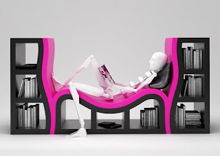
Console Book Shelves!

.
0 comments


I adore the form, the color and the idea of having a bookshelves with a carved in "bench". I am not sure how comfortable it is but it surely looks amazing!
Design: Stanislav Katz

Read More »»

Tuesday, November 11, 2008

Nike + Amp Watch!

. Tuesday, November 11, 2008
0 comments


Remote wrist device for controlling iPod and monitoring Nike+ Informations. Very stylish and very cool design.
Design: Scott Wilson with Stefan Andren

Read More »»

ACUBE OFFICE!

.
0 comments


This showroom space in an italian store that handles handbags and apparel is located in Aoyama, Tokyo. The design of the conference and show room into a multi-purpose allows different purpose to co-exist. The design of the chairs can be stacked to form a display cabinet.
Very sweet! I like the forms carved out "inside the cubes" very much!

Read More »»

T.S.A. Communication!

.
0 comments


I find this one of the most provocatory work I've seen lately! Airports are those symbolic places of control paranoia. This artist, through his work, makes sort of fun of the entire annoying situation! When taking a plane he puts in his suitcase laser cut 8.5 x 11 inch pieces of stainless steel with messages directed at the T.S.A. You can imagine what happens at the airport inspections! Sometimes they laugh but sometimes they don't!
Design: Evan Roth

Read More »»

Monday, November 10, 2008

7DAYS!

. Monday, November 10, 2008
0 comments


7DAYS is a series with seven sets of bed linen, each named after one of the seven days of the week. The seven sets each carry one of seven prints of a pillow and a blanket. 7DAYS is a concept that aims to tell the story from everyday life.
Very interesting!
Design: Dorte Agergaard

Read More »»

Magic Wall!

.
0 comments


I read about Fausto Salvi in an italian magazine. His history and work are very impressive. For those of you who didn't have the chance to read it just visit his website. Funky beautiful work!
Design: Fausto Salvi

Read More »»

Thursday, November 6, 2008

Transformer Shelf!

. Thursday, November 6, 2008
0 comments


Transformer Shelf is fully customizable. Composed by multiple sliding drawers and shallow trays this object allows to participate in the evolution of its shape. You can rearrange the different units towards each other, creating myriad different shapes.

Read More »»

Paper Art!

.
0 comments


There are endless ways of what you can do with a piece of paper. Write on it, draw, make a plane out of it. But what this artist can do with paper left me speechless!
Go check his website! Amazing work!

Read More »»